Tutorial: Plotting projected density of states with solid colors
In this tutorial for SrTiO3, we show how to upload DOS files, define projection filters, and generate, customize, and export projected DOS using solid-color styling.
Upload DOS files and parse #
The first step is to upload the required files from your DFT simulation. The upload panel indicates which files can be provided. In this section, you are also asked to provide the Fermi energy. If the Fermi energy is given, the plot will automatically shift the energies so that the Fermi level is set to zero.

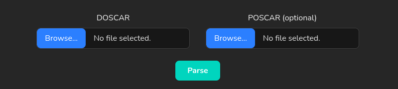
After selecting files, click Parse to load the data.
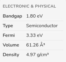
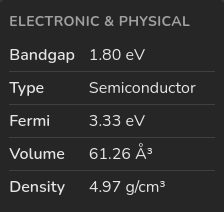
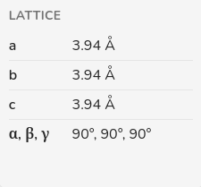
Review generated DOS report cards #
After parsing, the page generates report cards that summarize key results. You can expect values such as bandgap, material type, Fermi value, lattice parameters, angles, volume, and density. If the simulation is spin-polarized and the bandgaps differ between channels, the reports include values for each spin channel.
If you want this report in different units, use the Units panel in the right sidebar.
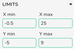
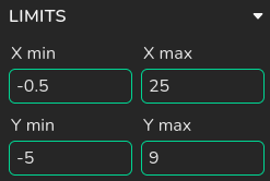
Step 2: Limits #
Limits
You can generate a baseline figure by clicking Plot, then refine the view using Limits in the right sidebar.
In projected DOS, this panel controls both energy and DOS-state windows. When you set energy limits, DOS-state limits update automatically to the selected energy window.
Navigation
Use the zoom sliders to focus on selected energy and DOS ranges. Drag slider handles to zoom in or out, and move the selected window to inspect different regions of the projected curves.

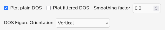
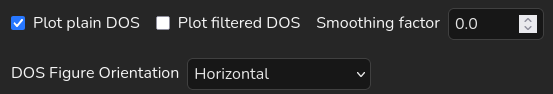
Step 3: Figure orientation #
To change the figure orientation in DOS plots and assign x and y axis to energy or density of states, use the Figure orientation drop-down menu located in the General Options. In this example, we used a Vertical orientation.
Step 4: Add filters and choose solid color styling #
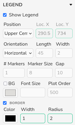
Click Add Filter to create a filter card. The app automatically enables Plot filtered DOS and disables Plot plain DOS; you can re-enable plain DOS if you want overlays.


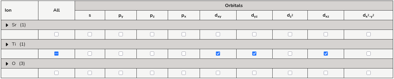
Each filter card is an independent projected-DOS trace. After adding a filter, select the ion, orbital, and (if applicable) spin entries in the projection table for exactly the contribution you want to visualize. You can stack multiple filters to compare different chemical or orbital channels in the same plot.
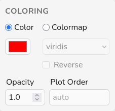
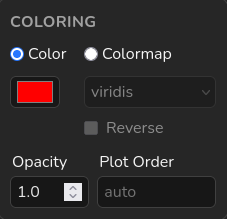
In each filter card, set coloring mode to Solid color and choose a distinct color for that contribution.
In the Coloring panel, Opacity sets transparency for the full filter trace
(0 = fully transparent, 1 = fully opaque), which is useful when several filters overlap. Use
Plot Order to control stacking: filters with higher values are drawn on top of lower
values, while auto keeps the default app ordering.
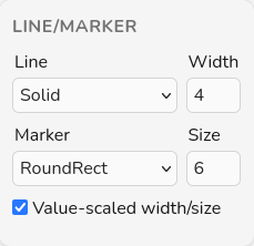
After defining filters, click Plot to render the projected DOS. If needed, refine line style, marker type, opacity, and labels in each card before plotting again.
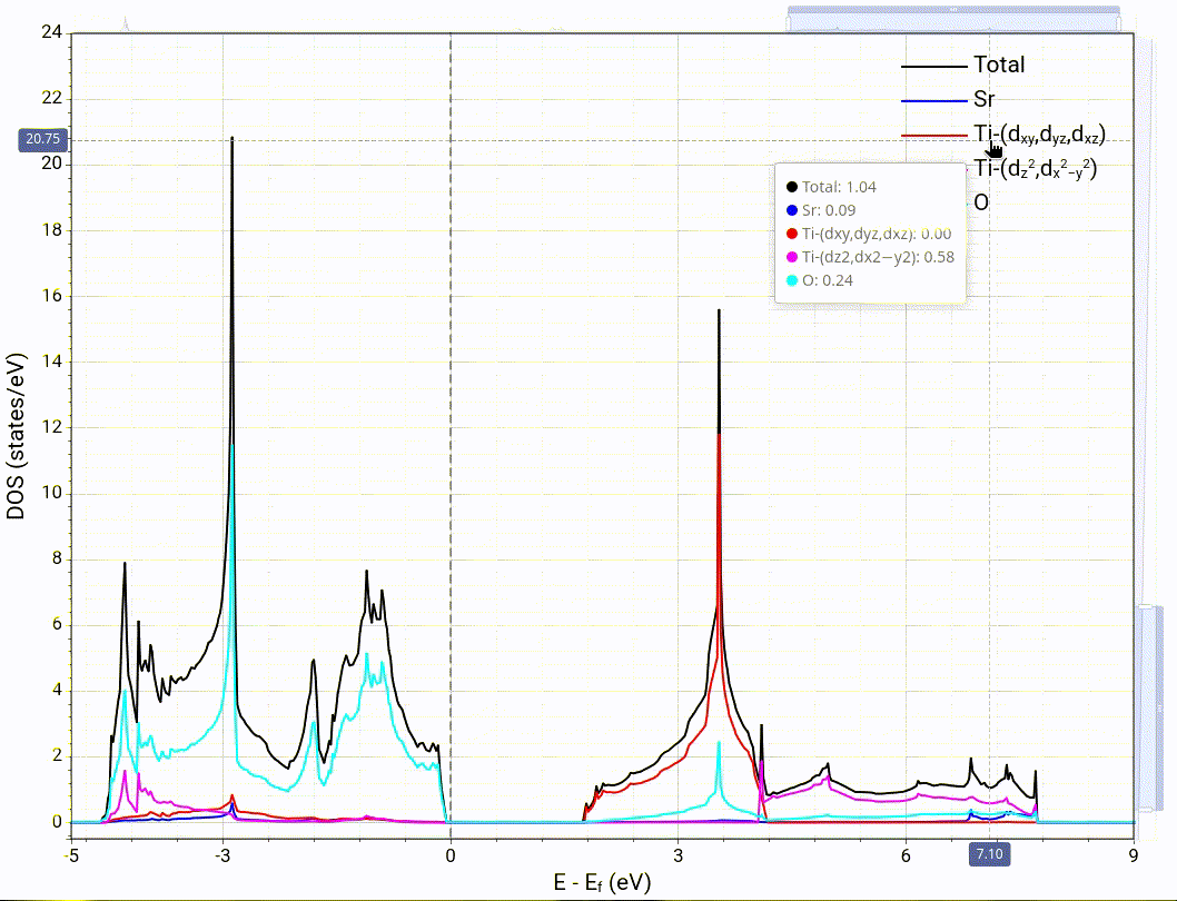
Step 5: Example filter choices for SrTiO3 #
In this example, we use four filters: one for Sr, two for Ti, and one for O.
Example selections:
Sr in red; Ti t2g (dxy, dyz,
dxz) in blue; Ti eg (dz2,
dx2-y2) in cyan; and O in magenta.
Legend labels can be entered manually, or you can leave them blank and use auto-generated labels based on the selected ions/orbitals.
After adjusting the selected filters click on plot to generate the projected DOS figure.

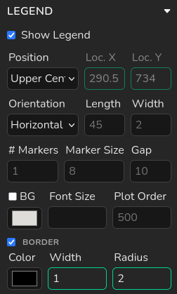
Step 6: Show and tune the legend #
Legend labels are automatically generated from each filter selection. If you want a custom label, use the legend panel inside that filter card. In the same per-filter legend panel, you can also adjust label styling such as color, weight, and style.
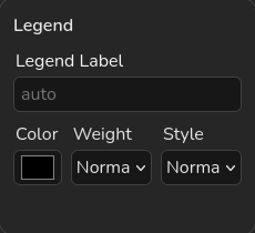
The global Legend panel in the right sidebar controls figure-level legend behavior.
Use it to show/hide the legend, choose from preset positions, or switch to Custom to
manually place the legend. You can also tune orientation, item length/width, marker count/size, gap,
background, font size, plot order, and border settings.
During analysis, you can hide or unhide individual filters by clicking their items in the legend.
Step 7: Customization and styling #
For axis, legend, font, colors, and other appearance controls, use the right sidebar and see the full settings reference in Plot Settings.
Step 8: Export the figure #
When your figure is ready, click the download button in the chart toolbar to export it. Use this to save a clean image for reports, slides, or publications.